Show most people a spreadsheet full of numbers and their eyes are apt to glaze over. Turn that data into a graphic, though, and suddenly it makes sense.
Just ask the student in University of Wisconsin-Madison Professor John Lee’s data visualization class who had previously muddled through a course on health policy—only to have a classmate’s visual representation of healthcare investments and outcomes around the world belatedly deliver some key lessons.
“I finally understand what they taught us last semester!” she blurted out.
In Interactive Data Visualization, a special topics course in the Department of Industrial and Systems Engineering, a mixture of undergraduate and graduate students learn to combine, organize and present data. They learn the ins and outs of the statistical programming language R and its open-source software RStudio, how to plot data in the visualization package ggplot2, and how to create interactive web applications in R Shiny.
Each student chooses a topic that’s both personally interesting and meaningful to society, gathers and manipulates datasets, and builds out a visualization.
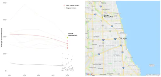 Graduate student Cole Soffa created visualizations using data from speed cameras in park and school zones in Chicago. This tool shows the average number of monthly speeding violations from cameras in park zones; those that recorded a high volume of violations are colored red. Users can click on each point to see the camera’s location on a map of the metro area.
First-year graduate student Ankur Aggarwal is drawing on his decade of work experience in the energy sector to develop graphics that detail the energy sources of American power plants.
“I hope to create awareness about optimal consumption of energy in U.S. households, cutting back on usage of fossil fuels and focusing on renewable energy sources,” says Aggarwal, who’s studying manufacturing and production systems. “Also, I intend to highlight the growth of power plants running on various renewable energy sources like solar, wind, biomass and geothermal.”
Katie Mummah, a PhD student in the Department of Nuclear Engineering and Engineering Physics, is also examining the energy landscape. Her visualization will allow users to see the sources of their electricity, both on a state and national level.
“I don’t think most people know the largest energy source in their state; for Wisconsin, it is overwhelmingly coal. I also want people to see the way their energy has changed over the last few decades,” she says, noting how wind power has grown exponentially over the past two decades to account for more than 6 percent of U.S. electricity in 2017.
Other students have taken on complex issues such as the prevalence of cancer across the state of Wisconsin as a function of arsenic levels in groundwater.
While Lee has taught the course three times in the past five years, in 2018 he added a twist by borrowing a format for feedback from a friend teaching a creative writing course at the University of Iowa. The workshop method provides students—working in small groups—with a framework for thoughtfully delivering constructive critiques and asking for feedback to ultimately improve their projects.
“It can be challenging to present constructive feedback,” Lee says. “There’s a temptation to say, ‘Oh, it’s ugly. It doesn’t work. It’s wrong.’ You have to learn how to present the feedback, but then you also have to learn to accept the feedback. It’s hard.”
So is presenting a visualization, which is why Lee invited Meriko Borogove, a former senior director of engineering at Apple who led development on the iPhone, to speak to the class. She shared firsthand lessons from presenting to Apple executives, like figuring out their individual quirks and preferences.
“Know your audience. Know what they like,” she told the students.
When Borogove offered to stay after class to critique the students’ in-progress visualizations, Mummah seized the opportunity to get feedback from a seasoned professional.
“Data and numbers are such a fundamental part of engineering,” says Mummah. “This class has given me the tools to visualize data faster, easier and better than I ever have before. I’m learning to think from a design standpoint to think critically about how I present data.”